Why Color Psychology Matters in Room Design
Room colors significantly impact mood, behavior, and cognitive performance based on psychological research and individual needs.
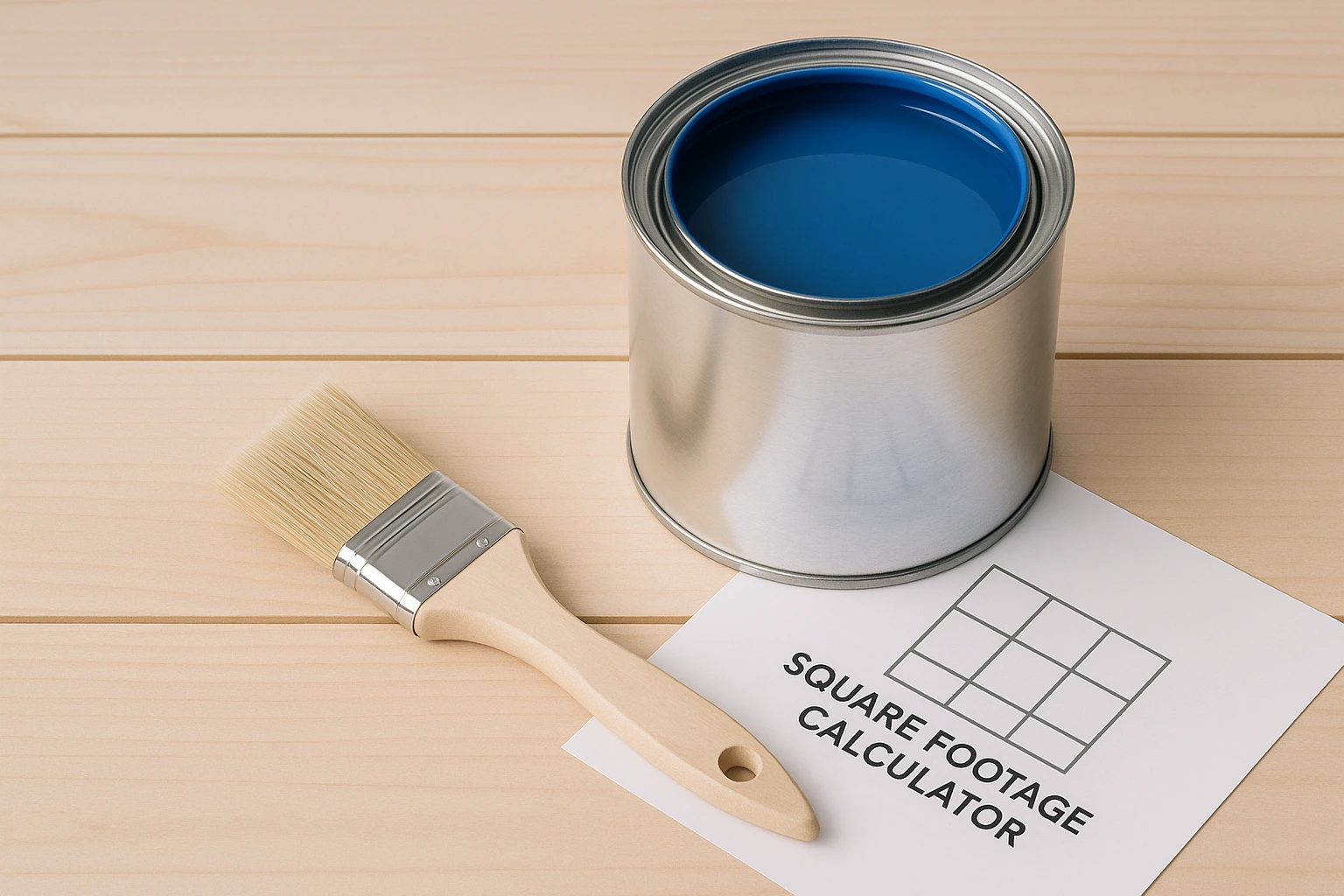
Use our live calculator below to get your perfect color recommendations in seconds.
What to Consider When Choosing a Color
Choosing the right color involves more than just picking your favorite shade. To create a truly effective space, consider these key parameters, which are also used in our interactive calculator:
| Parameter | Possible Values | Influence on Color Choice |
|---|---|---|
| Age | 0–2, 3–5, 6–10, Teen, Adult | Color perception and needs change dramatically with age. Infants respond to soft, simple colors, while teens might prefer more complex, expressive shades. |
| Room's Purpose | Sleep, Play, Study, Relaxation, Socializing | The room's primary function determines the desired psychological effect. A bedroom needs calming colors, while a study area benefits from focus-enhancing hues. |
| Temperament | Active, Anxious, Calm | The individual's temperament helps tailor the environment. An active child may need calming colors to wind down, while a calm child might enjoy more stimulating colors in a play area. |
| Gender | Male, Female, Not Specified | This is an optional factor that can influence the tone or shade of a color, but it's not a primary driver. Color preferences are highly individual. |
| Preferences | Favorite colors, exceptions | Ultimately, the person living in the room must like the color. This ensures the final choice is visually and emotionally accepted. |
Color Psychology Cheat Sheet
Here’s a quick guide to the psychological effects of different colors. Use this cheat sheet to find the perfect match for your needs.
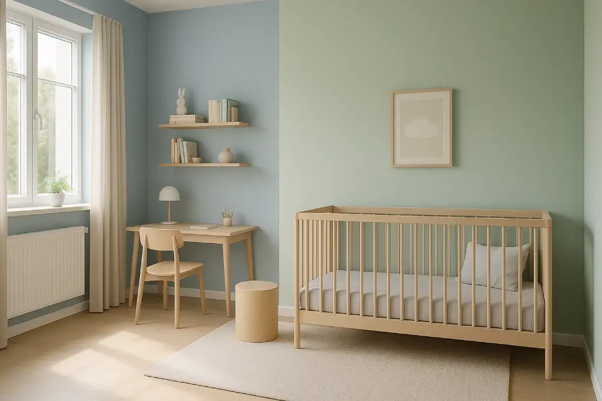
Blue
Effect: Calming, promotes sleep, lowers blood pressure.
Recommended for: Bedrooms, especially for anxious children or adults with sleep issues.
Green
Effect: Balancing, reassuring, improves focus.
Recommended for: Universal use; great for study areas and for children with mood swings.
Yellow
Effect: Stimulating, enhances concentration, joyful.
Recommended for: Playrooms and learning zones. Use softer shades to avoid overstimulation.
Pink
Effect: Creates a sense of safety, reduces aggression.
Recommended for: Young children's rooms and relaxation areas.
Purple
Effect: Sparks creativity and imagination.
Recommended for: Creative spaces, art corners. Lighter shades like lavender are calming.
Orange
Effect: Energetic, friendly, encourages communication.
Recommended for: Playrooms and social areas. Best used as an accent color.
Gray
Effect: Neutral, sophisticated, grounding.
Recommended for: Teenagers and adults; provides a good base for accent colors.

Comments
Loading comments...
Leave a Comment